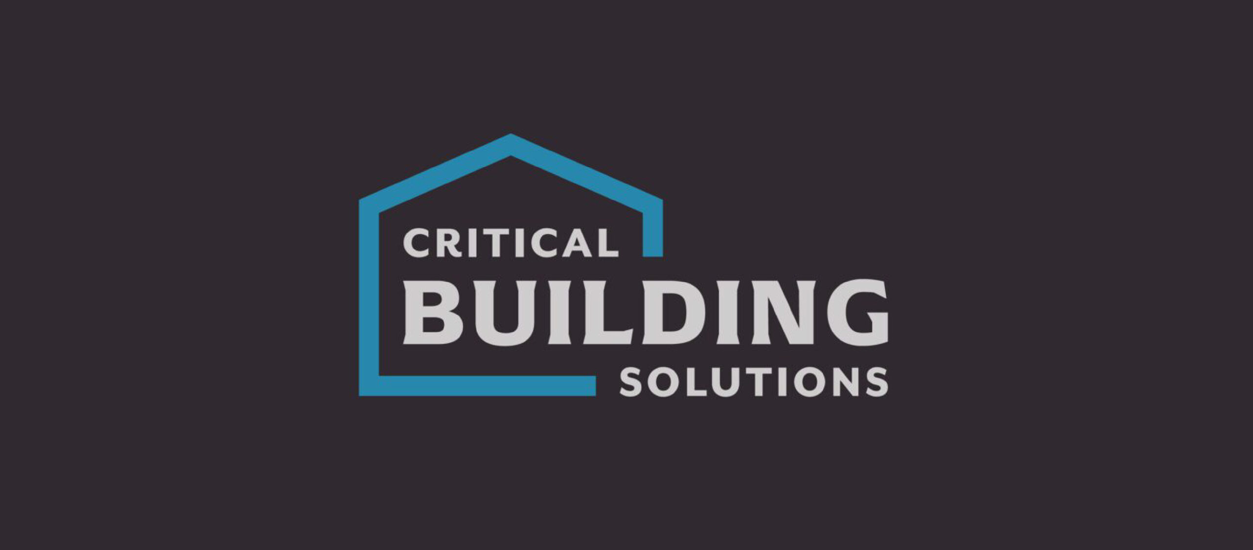
Critical Building Solutions Logo Design
Critical Building Solutions is a Cartersville-based company that offers remodeling, renovations, and home repairs. I created their logo design, established the brand’s visual identity, and collaborated on the website design.
For the logo design, the client requested something rugged yet timeless. We went through several versions of this logo before settling on a design with a balance between visual interest and simplicity. I used colors the brought to mind reliability, such as the sky blue and asphalt gray. I incorporated the font Arpona because its triangular slab serifs resemble the architectural elements of a home. The sans-serif font Mr Eaves complements Arpona’s ruggedness with its softer, rounded shapes that creates a sense of balance in the design.
As part of the overall brand, I incorporated textures that would be found inside of a home–such as stone countertops and sheetrock walls–to add dimension to the website.